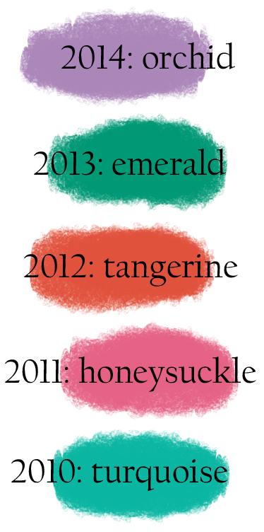
 Earlier this month Pantone selected its Color of the Year for 2014: “Radiant Orchid,” or 18-3224 in the Pantone color-specifying system that prevents designers from having to say, “It’s a kind of purpley lavender… No, not that bright.”
This business of selecting colors may strike normal people as complete horse hockey, but I am pretty sure if you are in charge of telling Kitchenaid what colors to spin up in its new manufacturing lines, you want some research on your side. Here’s one of the Fresh New Colors they rolled out in March 2013 (kitchenaid.com photo):

Saks Fifth Avenue has already “invested” in orchid, the AP said in a story that quoted their senior fashion director.
Though I pay more attention to color than to fashion, even I saw a fair number of purses and such appear in 2011’s honeysuckle. There are young women traversing campuses in tangerine (2012) skinny jeans now. And a few years earlier I think Pantone predicted the wave of chocolate-brown-plus-pale-blue that swept through home decor (at least around here).
How they pick the Color of the Year, according to their press release:
Pantone quite literally combs the world looking for color influences. This can include the entertainment industry and films that are in production, traveling art collections, hot new artists, popular travel destinations and other socio-economic conditions. Influences may also stem from technology, availability of new textures and effects that impact color, and even upcoming sports events that capture worldwide attention.

Leave a comment